Development Guide
Notes
-
Content should be 1200px wide, unless it is a full width module. The
.section-moduleclass takes care of this. - The pages are responsive. Common breakpoints used are 900px for tablet and 767px for mobile. 600px is the most next common. This is a rule of thumb, feel free to add additional breakpoints as necessary.
- Responsive columns are built with a library called flexbox grid
-
.custom-page-contentshould wrap the entire CMS page so that the styles scoped for these pages are applied.
-
.section-modulewraps all heros, modules, and banners.
-
.full-widthwill make a section-module full width
-
.module-titleis used for the title of each module.
-
.supporting-textis for standard text.
-
.light-themewill turn text white. I usually put it on the.contentor.text-wrapper.
-
.primary-light-buttonwill give you an outlined button that is white with
-
.module-link .dark-themewill give you a filled button with white text and a dark background.
-
The following is currently the basis for modules where there is text over the image. The image is displayed as a block.
.text-wrapperis positioned absolutely on top of the image. I prefer to use percentages so that it stays consistent to specific points on the image.
Usually the images swap at 900px and 767px for tablet and mobile, respectively.
Frequently, the text on top of the image moves to below the image in responsive views. To achieve that, removeposition: absolutefrom.text-wrapper.
Additional styles to help are:
.desktop-light-theme- text will be white in desktop, standard text color at 900px and below.
.tablet-light-theme- text will be white 767px and up, standard text color at 767px and below.
.desktop-primary-light-button- button that is the primary outlined button in white on desktop views, switches to black border and text color in responsive views.
.tablet-primary-light-button- button that is the primary outlined button in white down to 767px, switches to black border and text color for mobile views.
                    <style>
                        .image-wrapper {position: relative}
                        .text-wrapper {position: absolute; top: 15%; left: 20%;}
                    </style>
                    <section class="section-module">
                        <div class="image-wrapper">
                            <a><img /></a>
                            <div class="text-wrapper">
                                Copy content
                            </div>
                        </div>
                    </section>
Main/hero modules


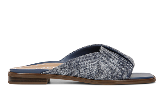
On Point
Meet Klara, the perfect ballet flat.

Style for the modern woman with support
that resets the concept of comfort.

Banners and secondary modules

Ends MARCH 11
FREE SHIPPING
Applies to ground economy shipping only
BALANCE BEGINS WITH VIONIC
Explore sandals, sneakers, dress shoes, and more that harness science to make every day better.

WHAT WE’RE LOVING
We’ve curated our favorite collections for you.
-

Everyday essentials
shop flats -
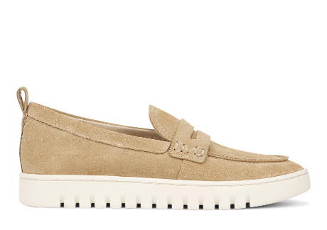
Freedom to flex
Shop loafers -
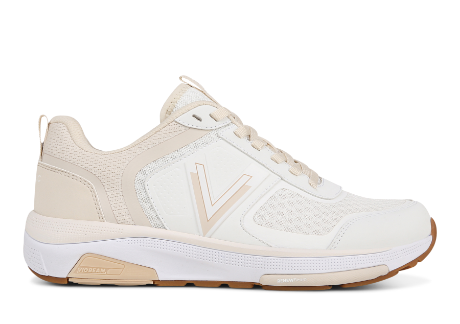
Tried & true
Shop white sneakers


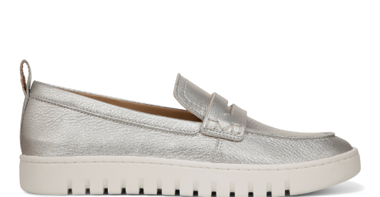
Additional Page Modules

★★★★★
”Very comfortable and stylish.
It’s a nice compliment to the
white sneaker trend while still
being classic and elegant.“
- Jennifer
Recover faster return stronger
Engineered with our advanced recovery system, VRX. Designed to balance with ultra cushioning,
support and stability.

★★★★★
”These sandals feel like they understand my feet
had a long day and are in need of comfort!“ - MARIA


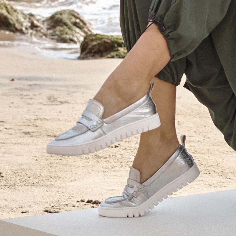
Find your balance
Level up your sneakers with a perennial favorite.

MADE FOR HIM
Constructed to keep your mind and body aligned.


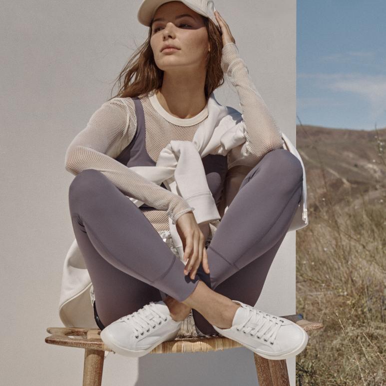
Where Science and Self Meet
Designed with Exclusive Alignment
Technology to balance the whole you.
Where Science and Self Meet
Designed with Exclusive Alignment
Technology to balance the whole you.

SOLE CIRCLE REWARDS
REWARD YOUR FEET. REWARD YOURSELF.
SOLE CIRCLE
REWARDS
REWARD YOUR FEET. REWARD YOURSELF.


FOLLOW @VIONICSHOES ON INSTAGRAM

The Science of Style With Maximum Comfort
Too often, finding the perfect comfortable shoe for women comes at the expense of style, forcing you to choose between comfort and appearance. At Vionic, we’re disrupting the footwear space by transforming how people view women’s shoes - from women's walking shoes to high heels to slippers and everything in between. Read more...